Success

Thank you

Thanks for reaching out!
I try to respond within 2 business days.

Contact

Shoot me a message – I'd love to chat.

design@seanreibling.com

Campus Workplace Study

Interactive web experience for York University

The pandemic has impacted almost every aspect of life, the workplace being no exception. As part of an international research effort to examine the effect of the pandemic on workplaces, researchers at York University's Global Labour Research Centre collected data from faculty and staff members (voluntarily) to better understand the impact of the pandemic on employee productivity, mental health, and overall well-being as well as examine shifting trends in employee wants and needs. The objective of this project was to visualize the aggregate data, which was compiled into a report, in a way that was accurate but also digestible. ‍

In collaboration with Ingrid Wong and York University's Department of Design, a series of charts were produced and approved by the GLRC. The selection of bar and pie charts help present the data in clear and concise way, while the chart colours align with the university's branding and identity. A website was then developed to organize and highlight these charts along with additional content for added context. The final website features five pages, one for each section of the report, as well as a general homepage to explain the nature of the research study. One of the goals was to create an experience that felt engaging and fresh, which led to the implementation of both vertical and horizontal scrolling. The page layouts include ample margins and padding to reduce visual clutter, and a clear navigation was implemented to guide the reader seamlessly through the report.

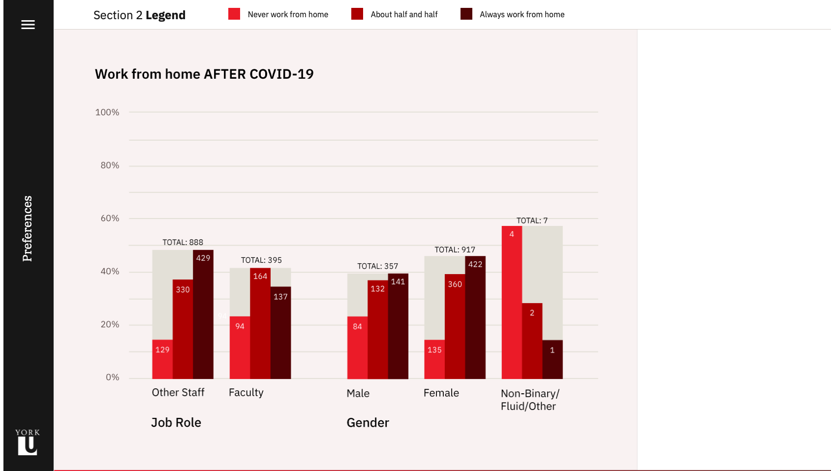
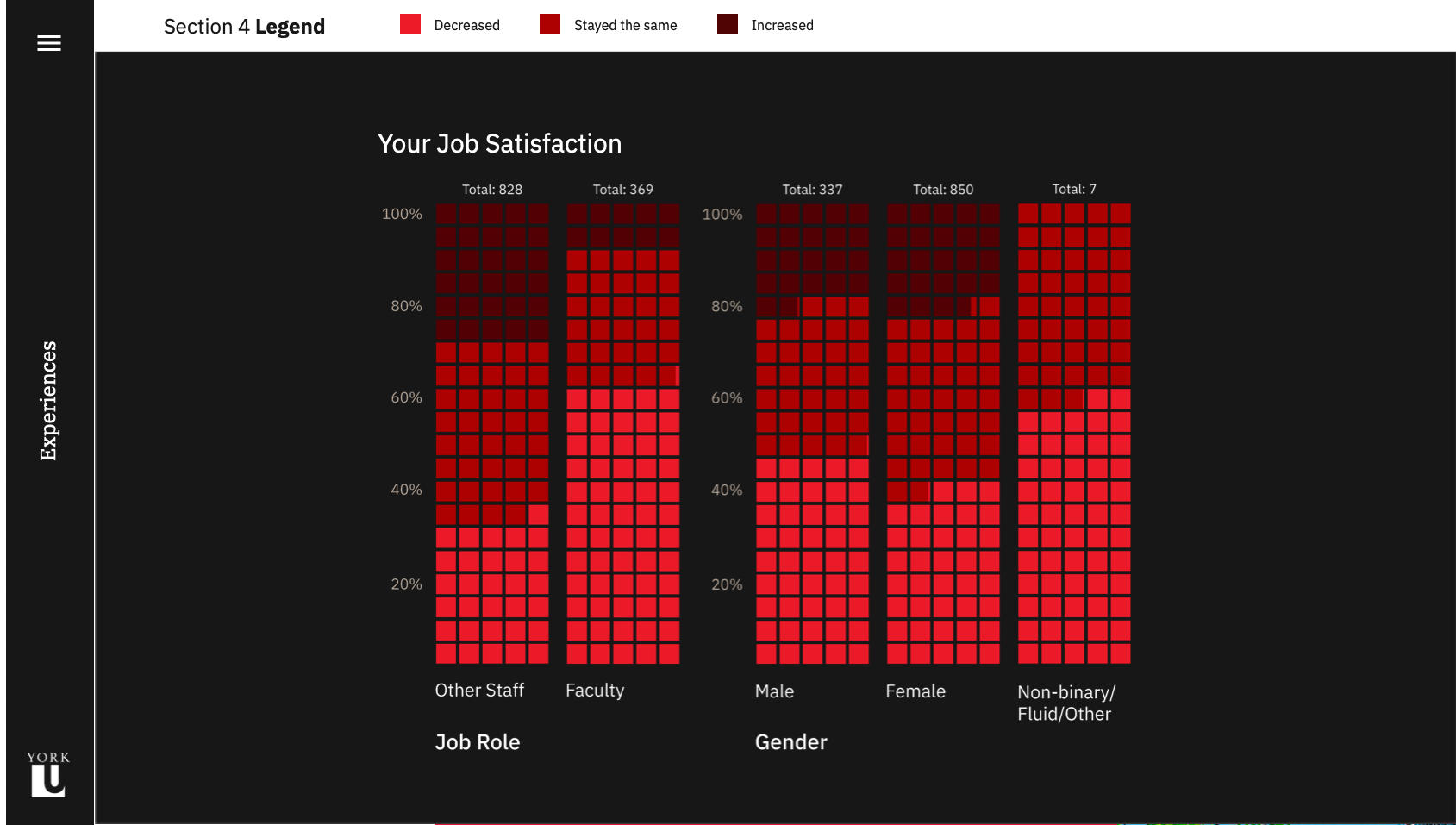
The selection of bar and pie charts help present the data in a clear and concise manner, while the chart colours align with the university's branding and identity.

The Design

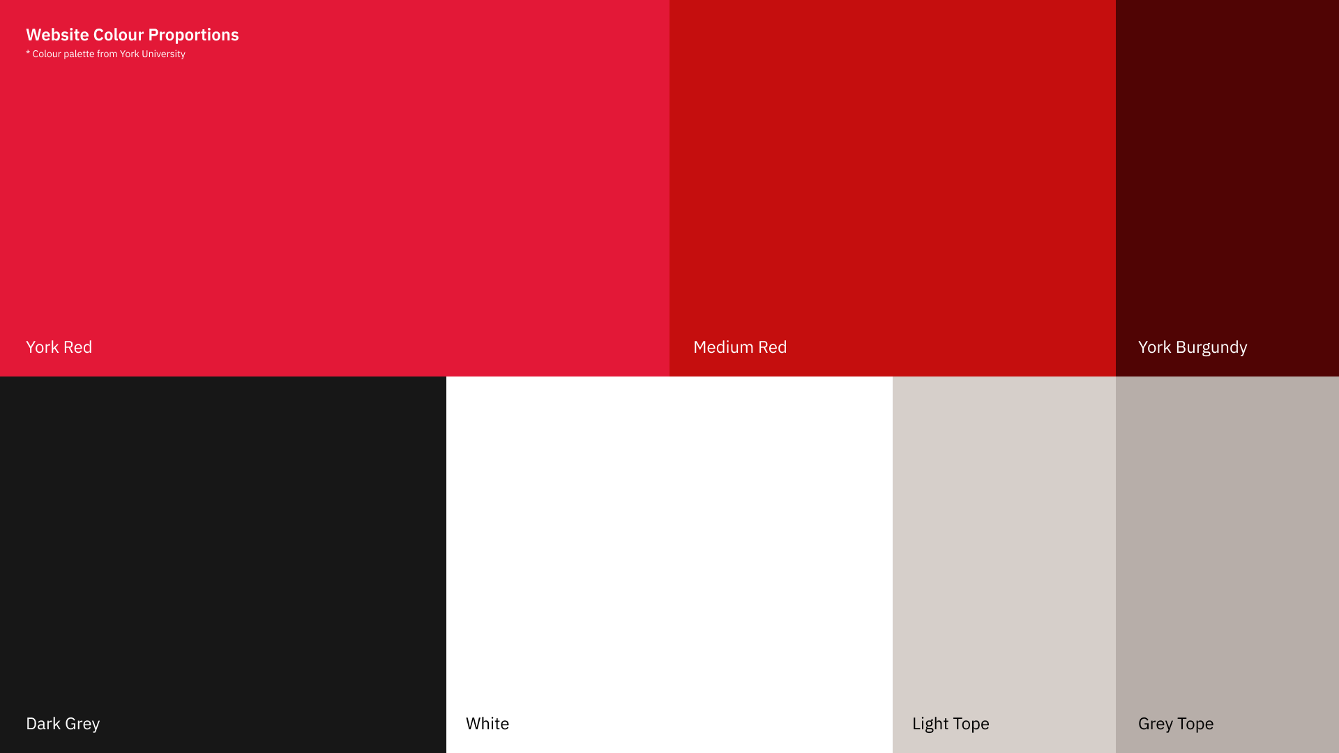
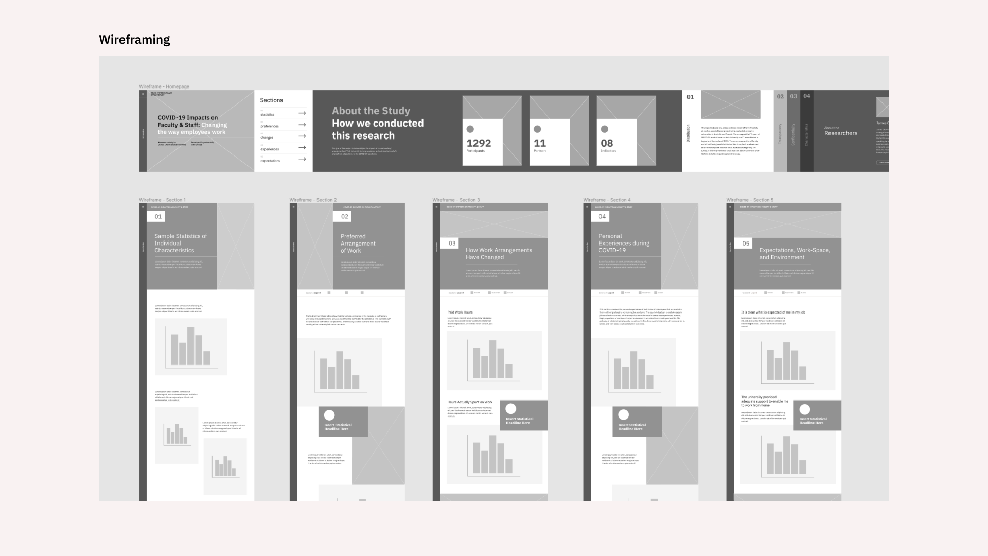
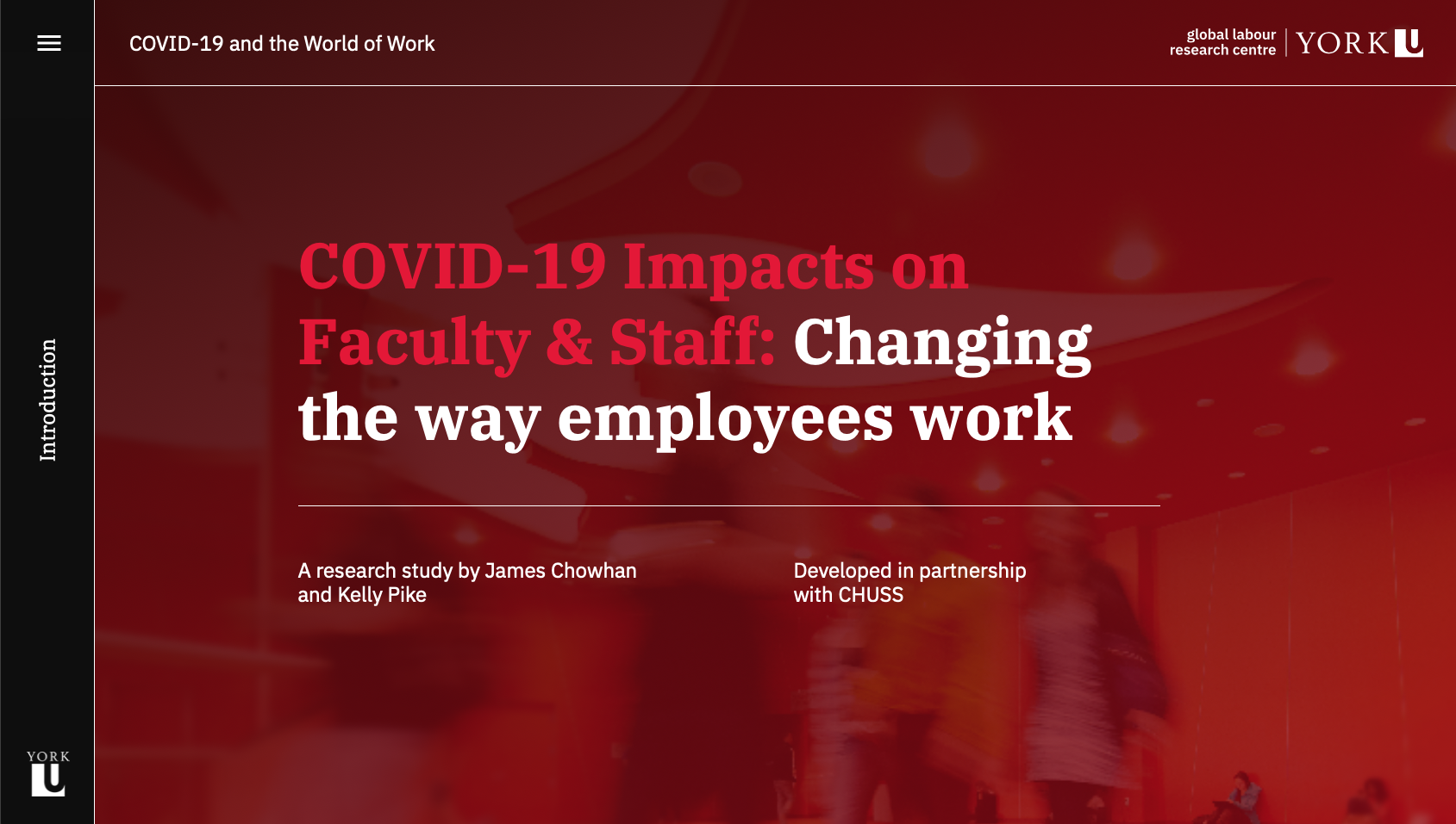
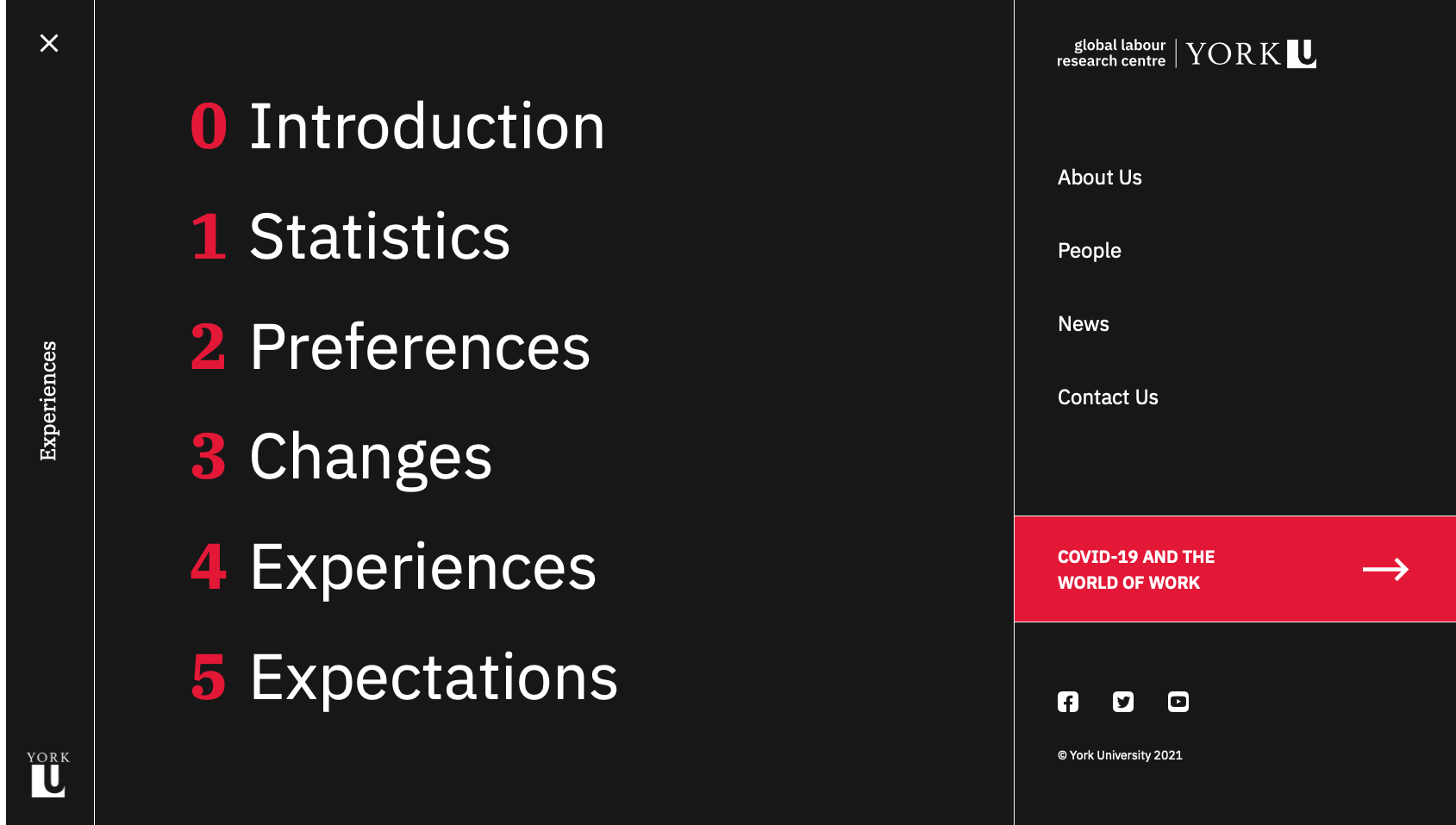
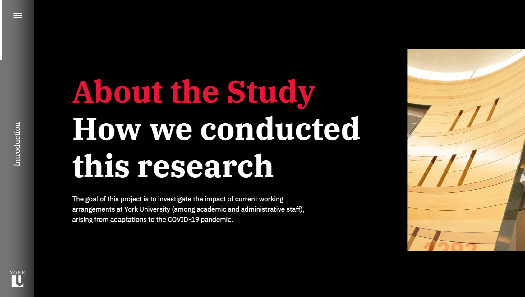
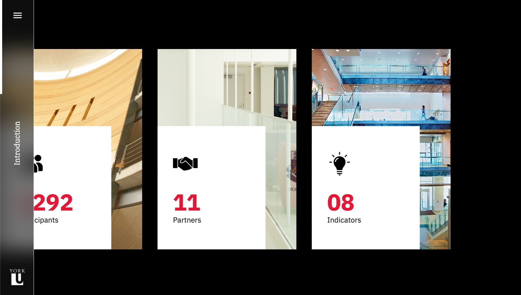
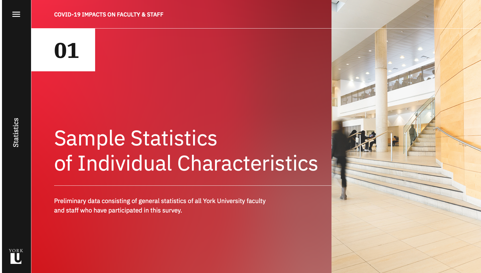
Although the visual branding of the site is centred around the York University colour palette, the layout and interactions diverge from the university's website to create an immersive and engaging experience for readers. The site is custom built to display the content of the study, and each of the five sections of the study are optimized for the chart types they contain. The homepage was designed to scroll horizontally, creating a distinction between the report pages as well as a memorable interaction. The alternating colours and positioning of charts adds visual interest and flow to each page, while the section hero banners contain a custom bright gradient using university colours, which clearly indicate the beginning of a new section.

The Process

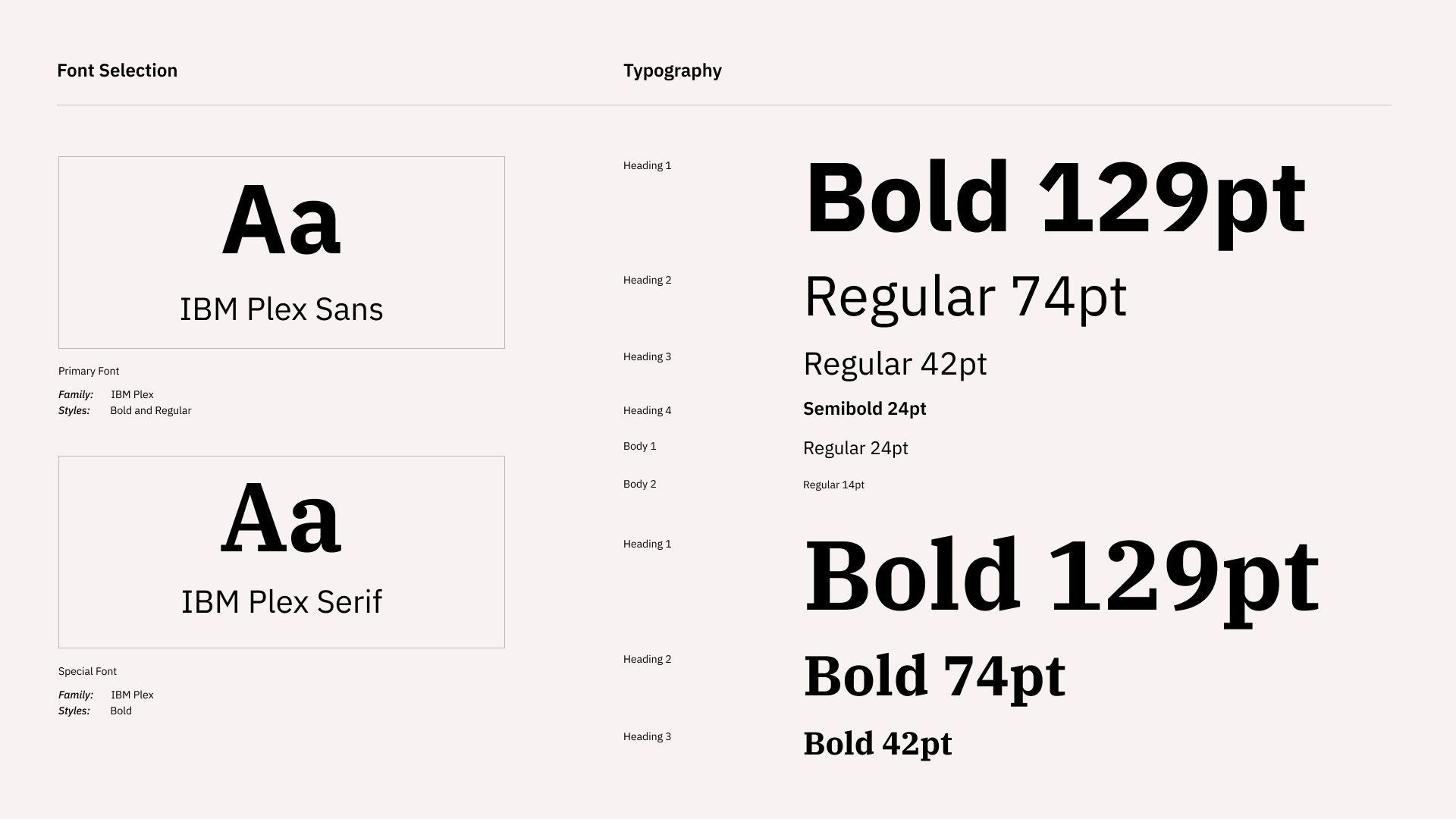
This project was developed over a period of 4 months, and involved much consultation between the researchers to ensure that the data was accurately represented. After the charts were collaboratively developed, the general web layout was researched and hand-sketched to provide a solid launch point for the project. Next, the specific structure and content of the site was detailed, followed by the development of wireframes using Figma. These wireframes were later expanded into high-fidelity mockups following the development of the website style guide, which included typographic hierarchy, colour palette, vector assets, images, and more. Finally, the site was developed, tested, and launched via a press release from the GLRC.

More Projects