"This project has beautiful, tight typography with a design opinion
but
allows each
individual designer and their work to come forward. The splash page and the animation with the
cubes
is a real statement feature that sets the desired tone."
Judges,
RGD Student Awards
Emphasizing the work
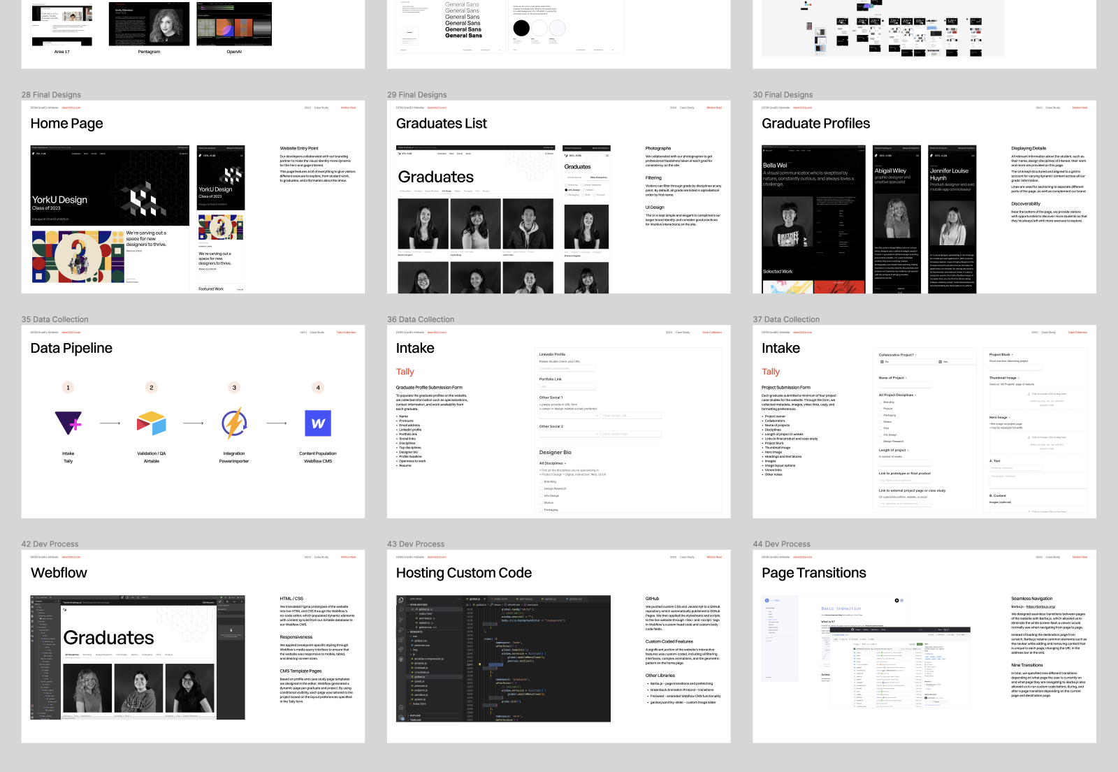
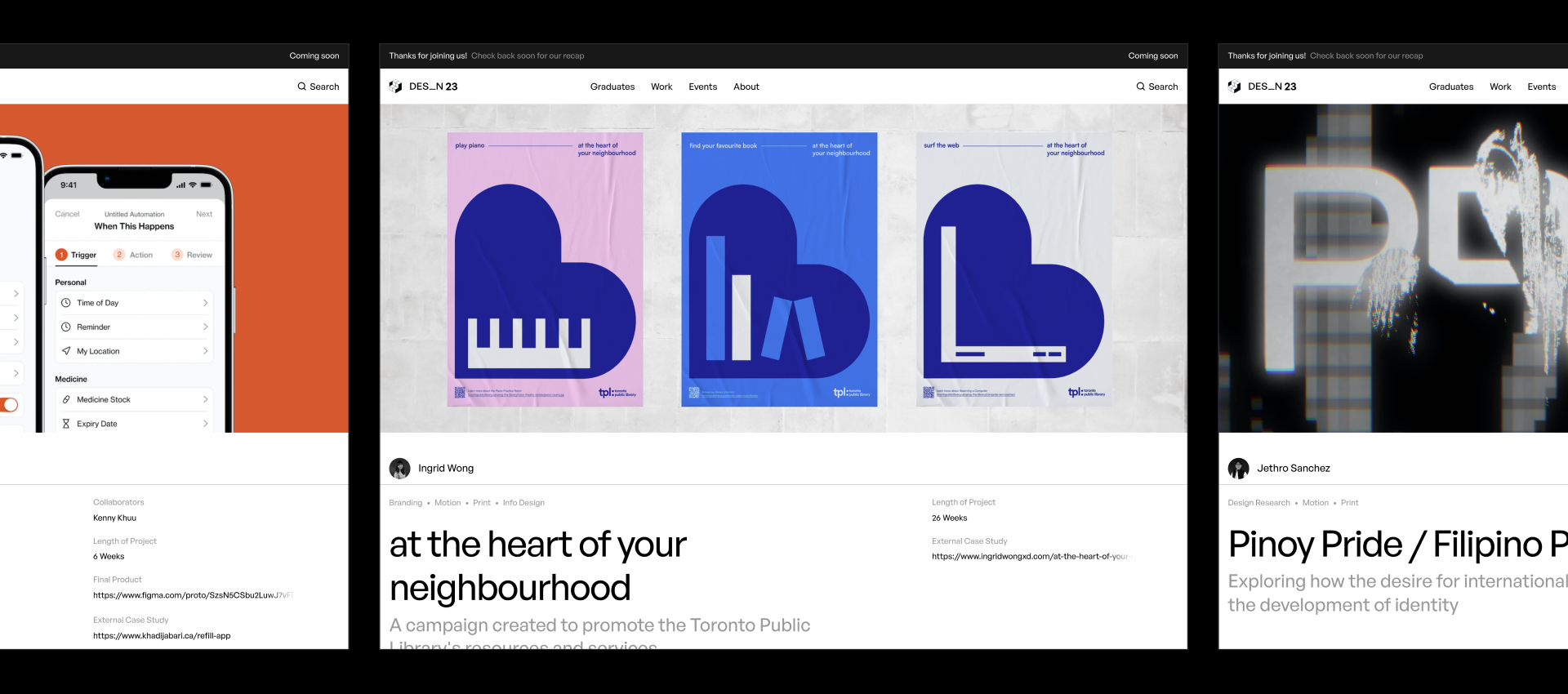
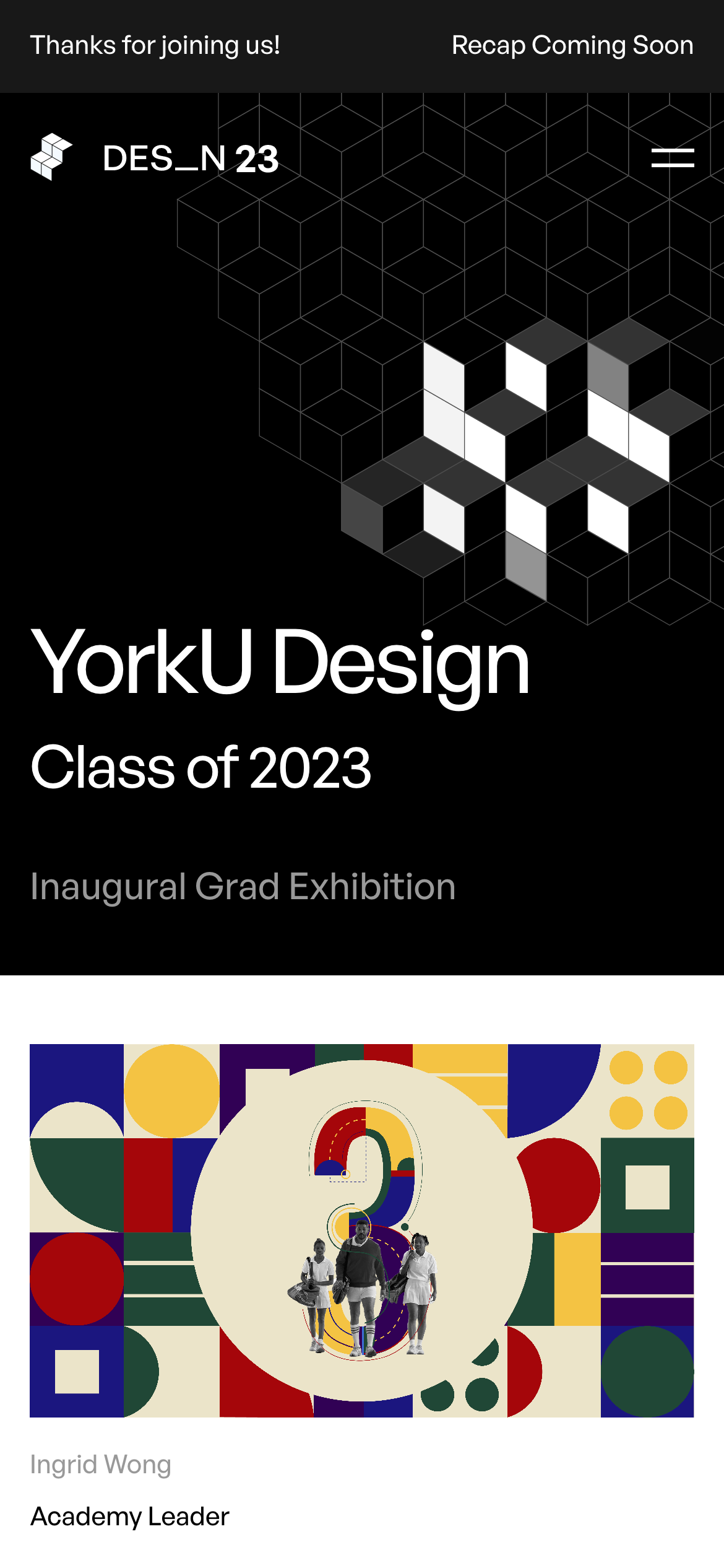
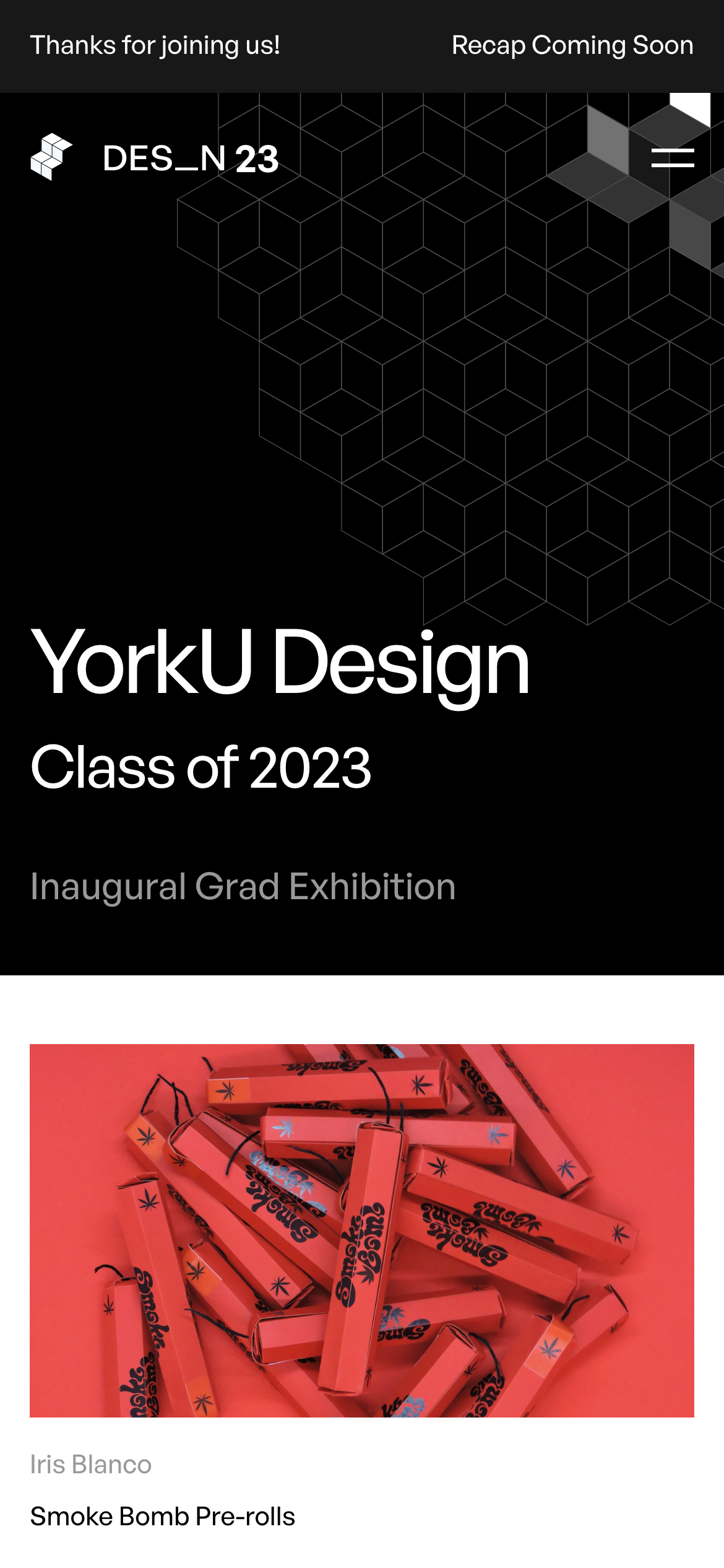
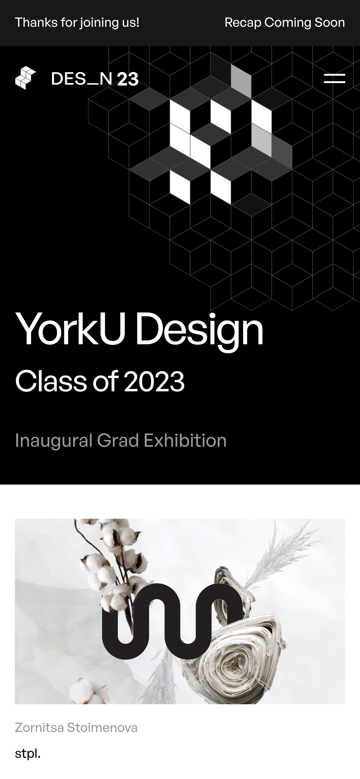
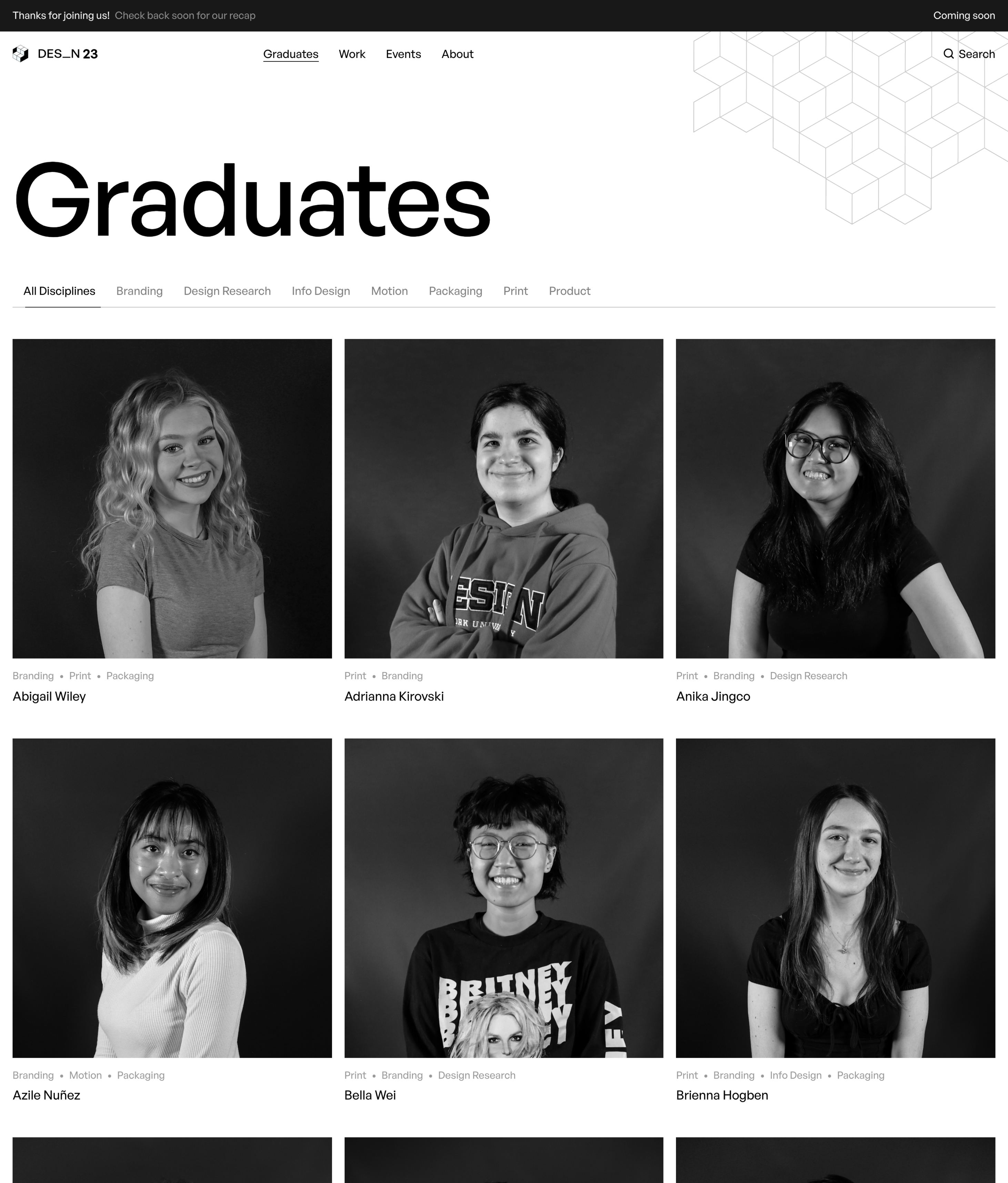
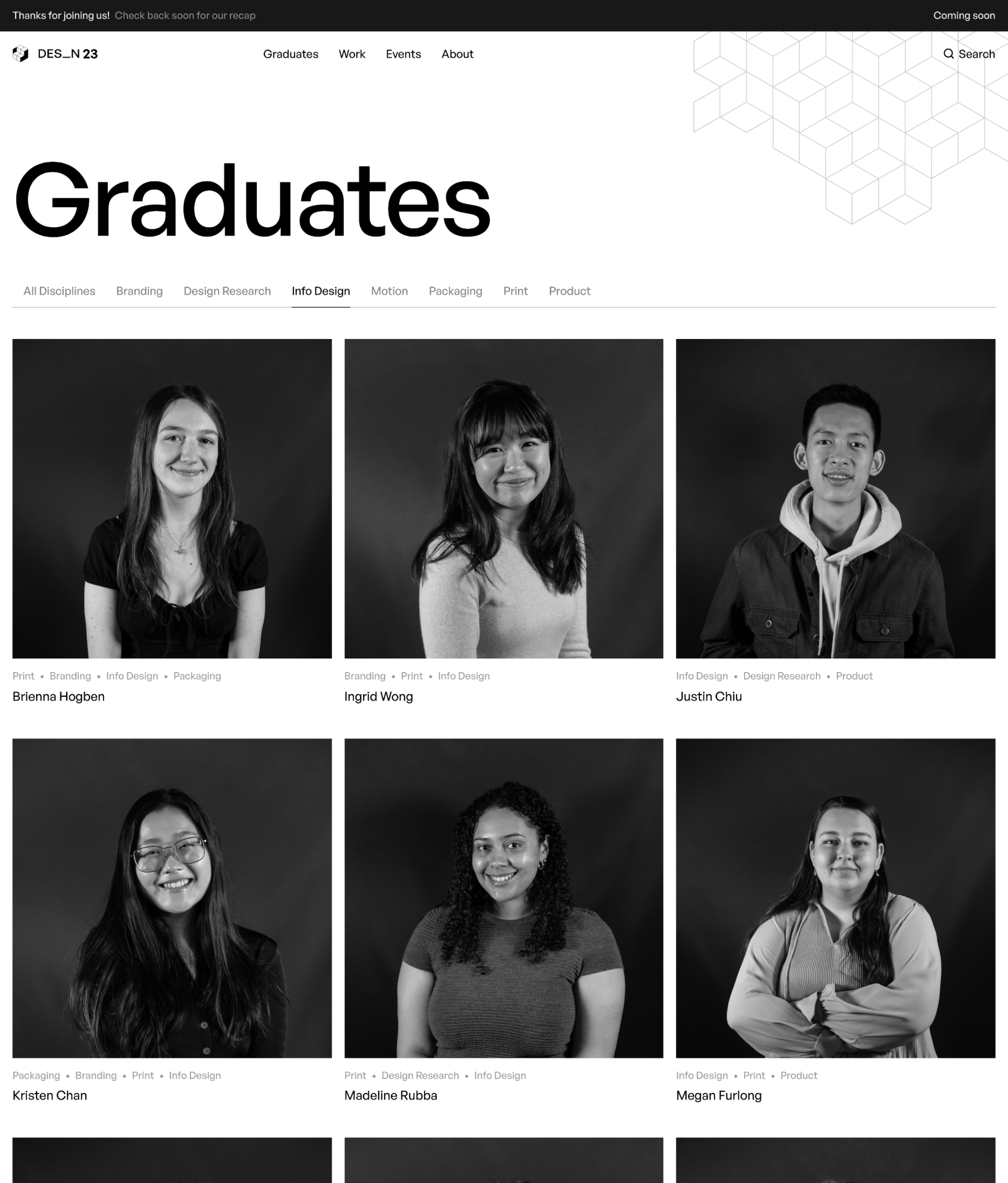
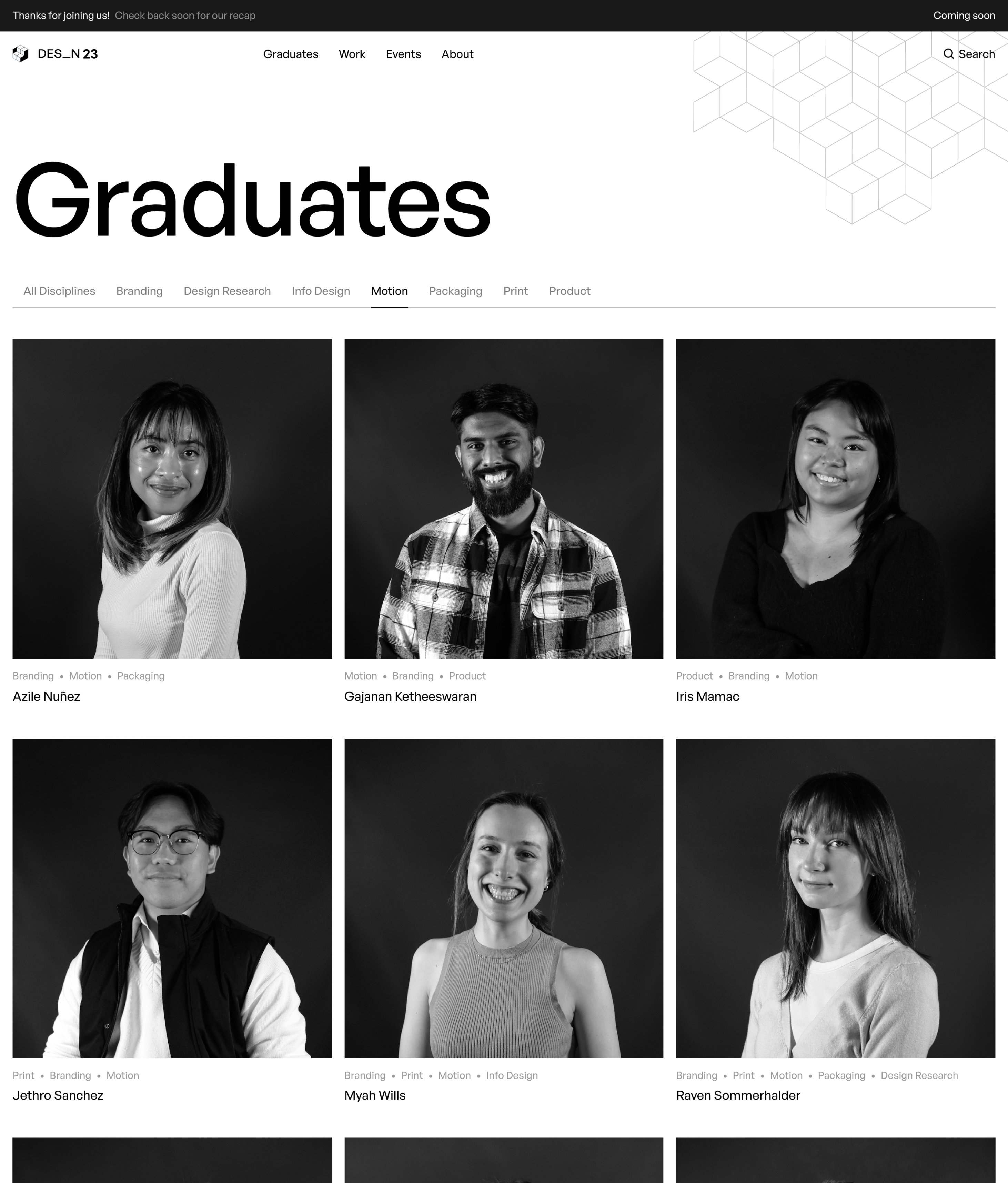
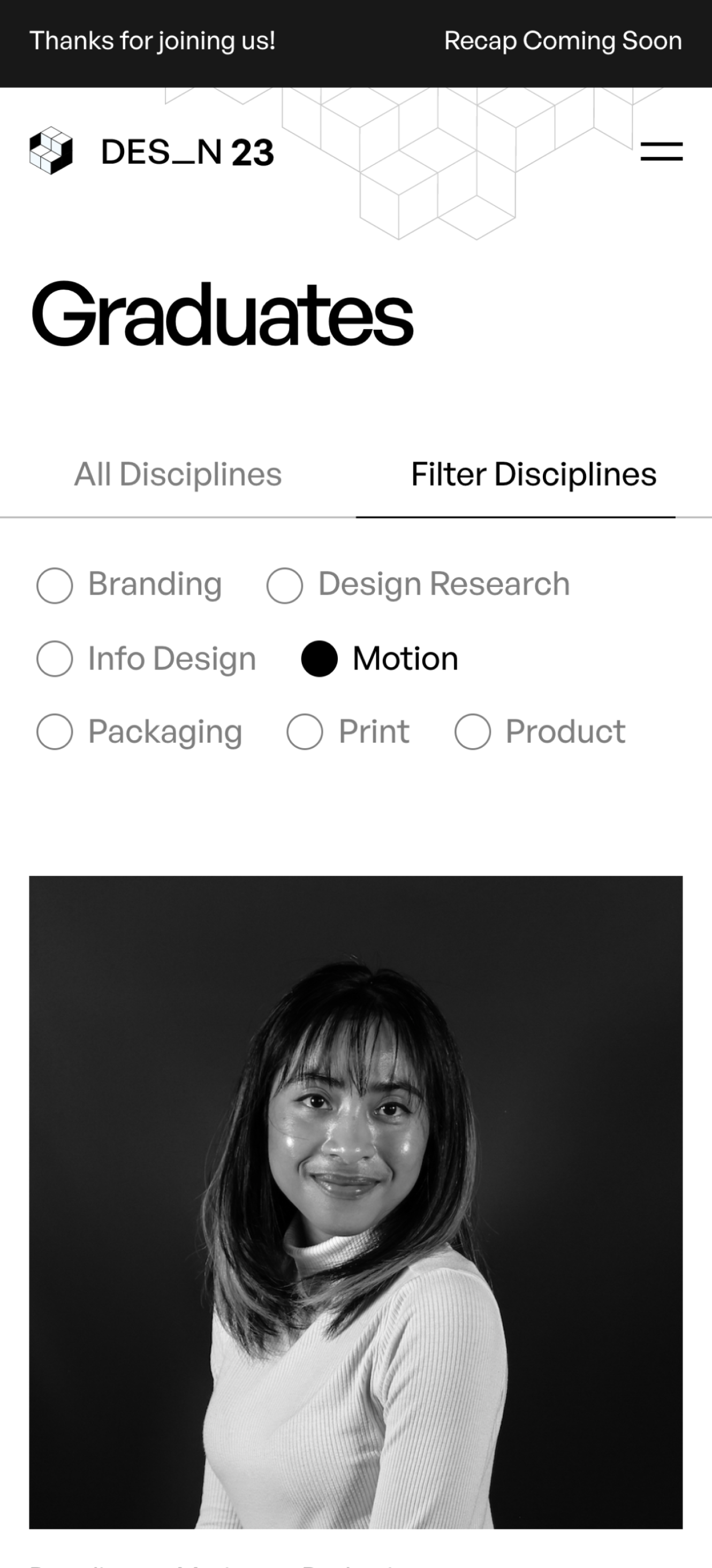
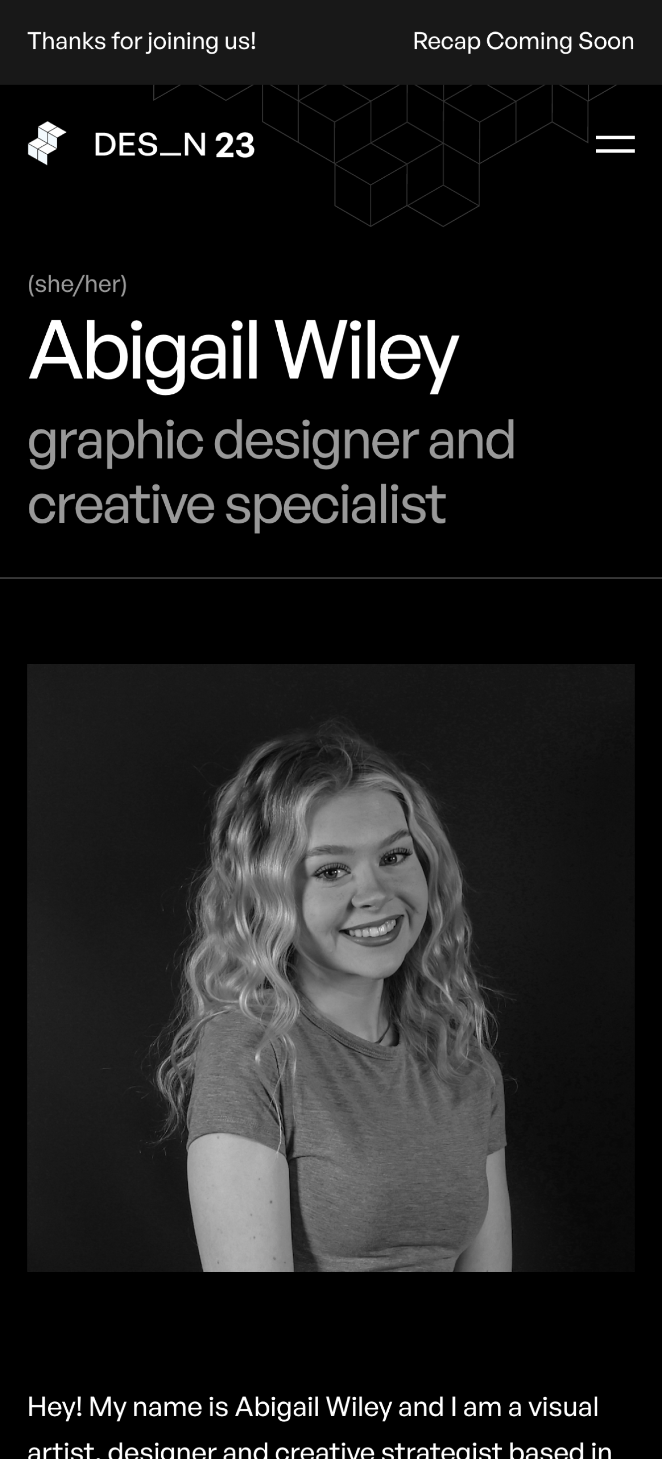
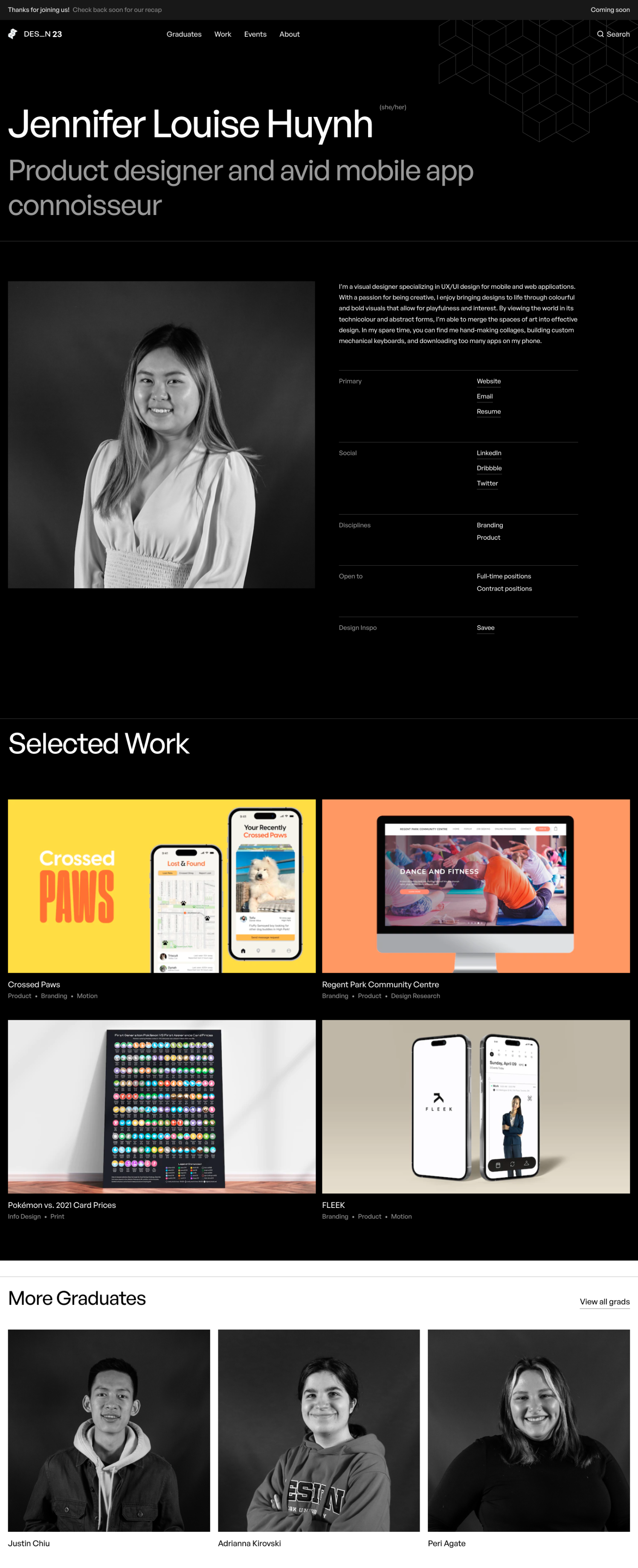
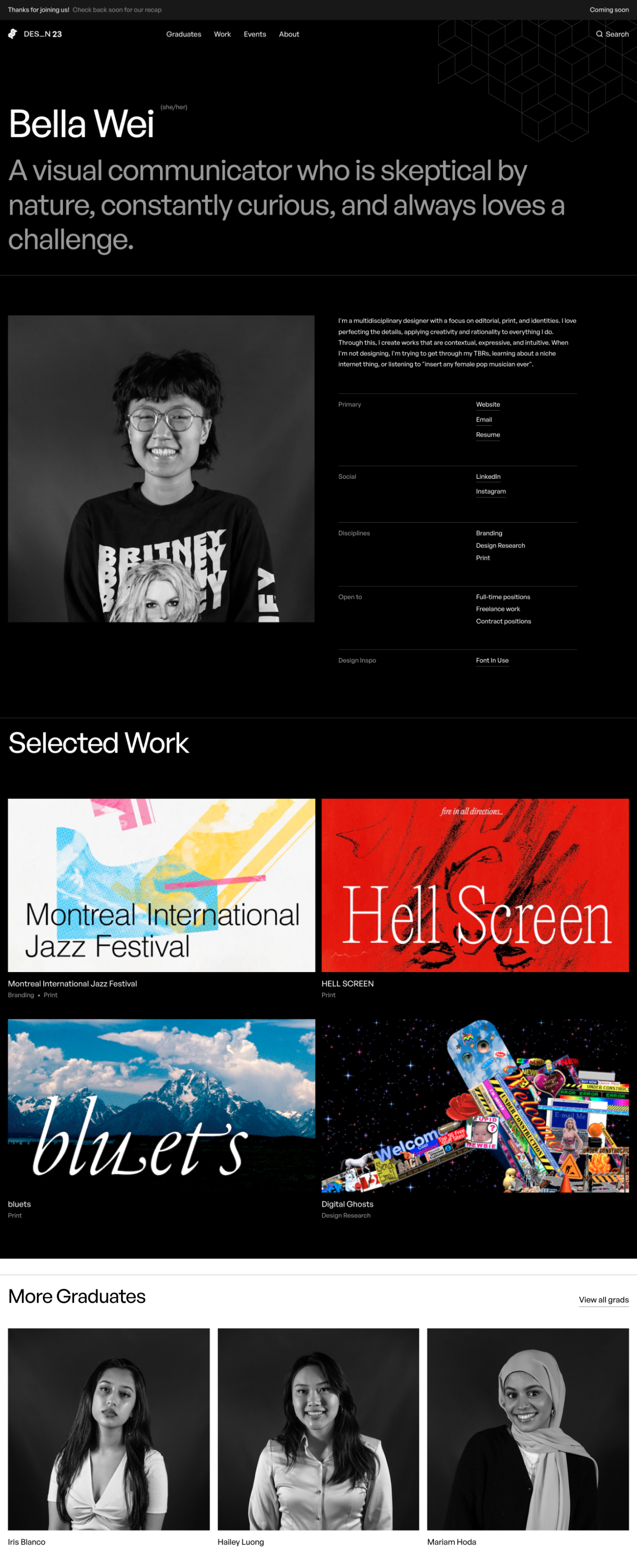
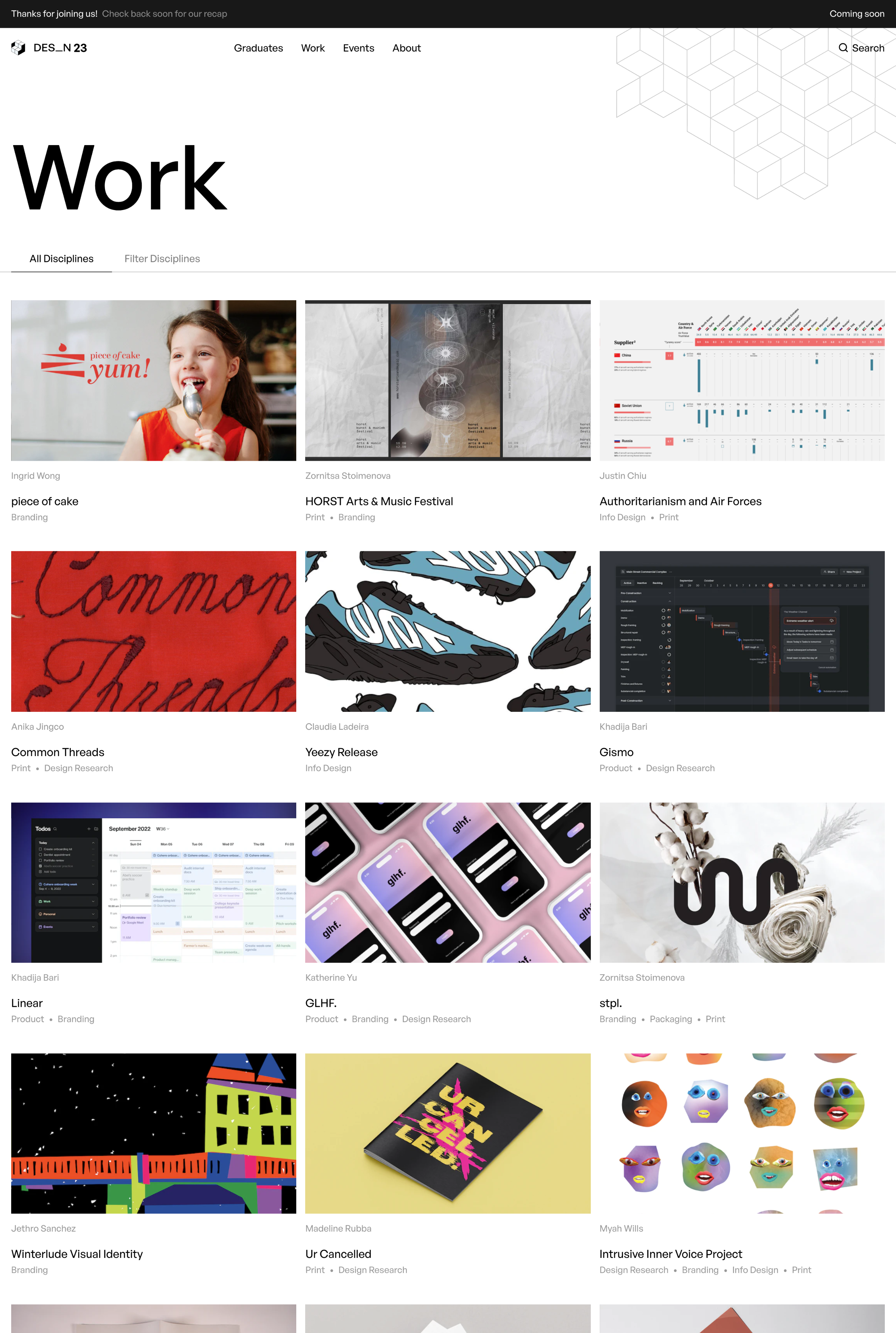
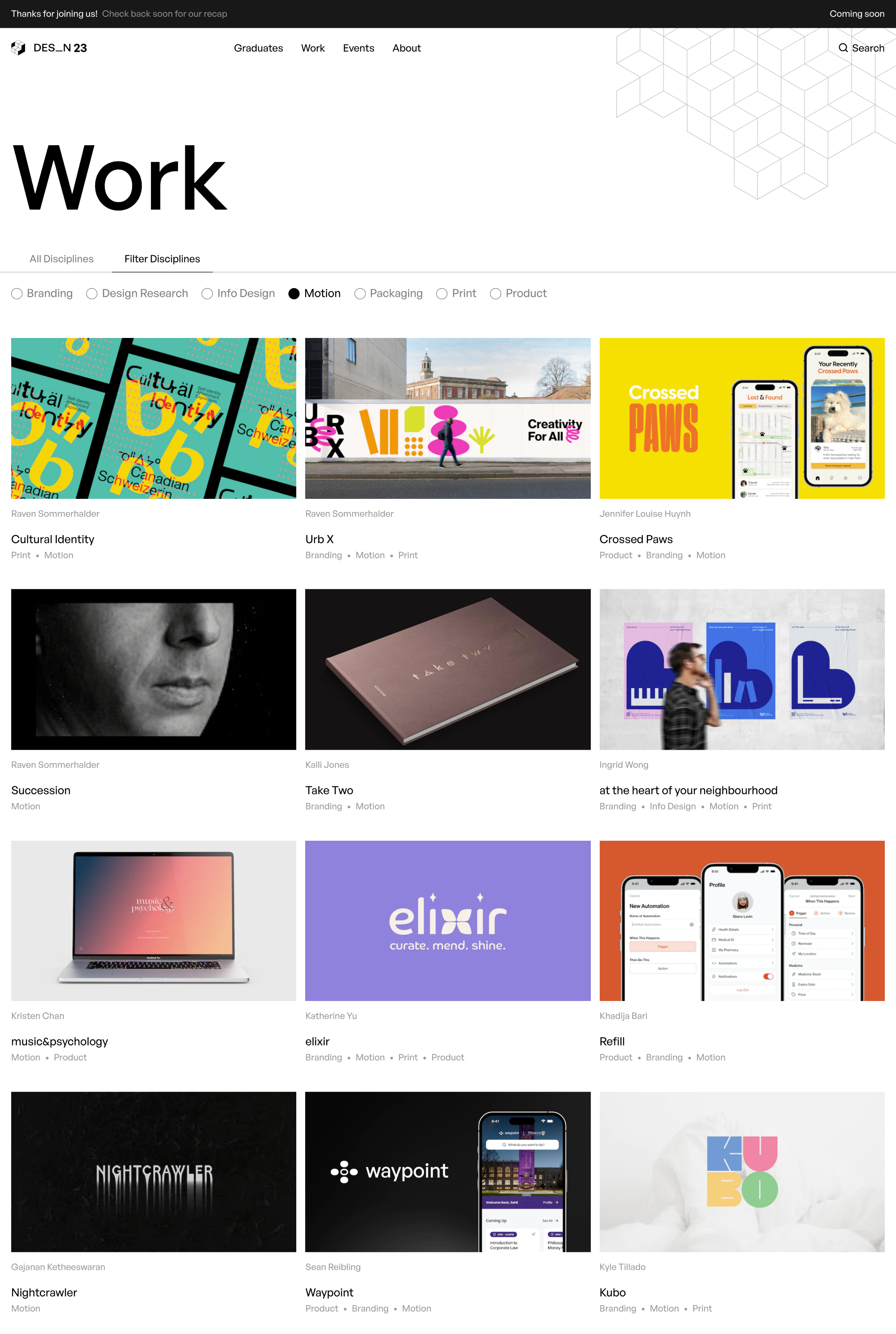
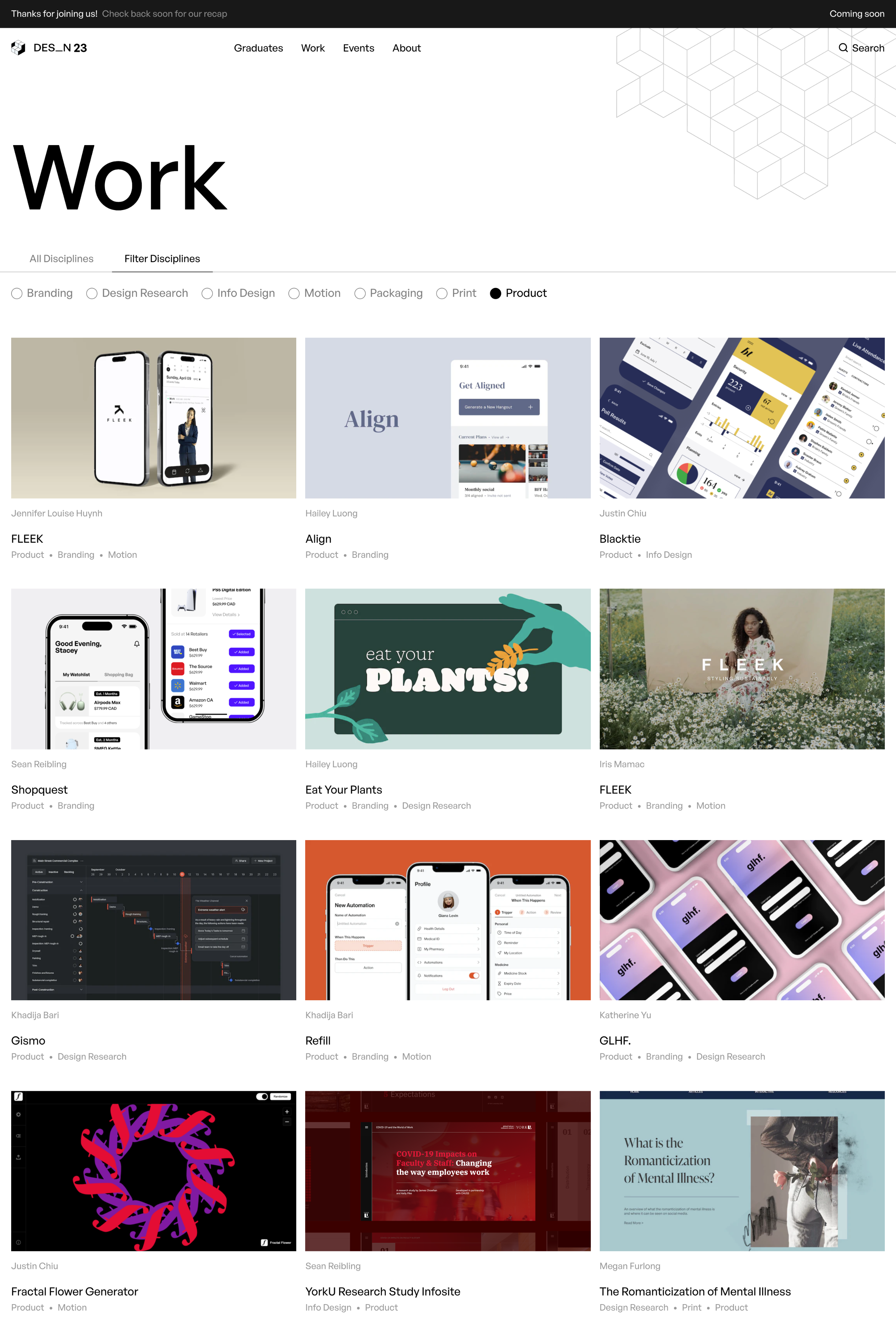
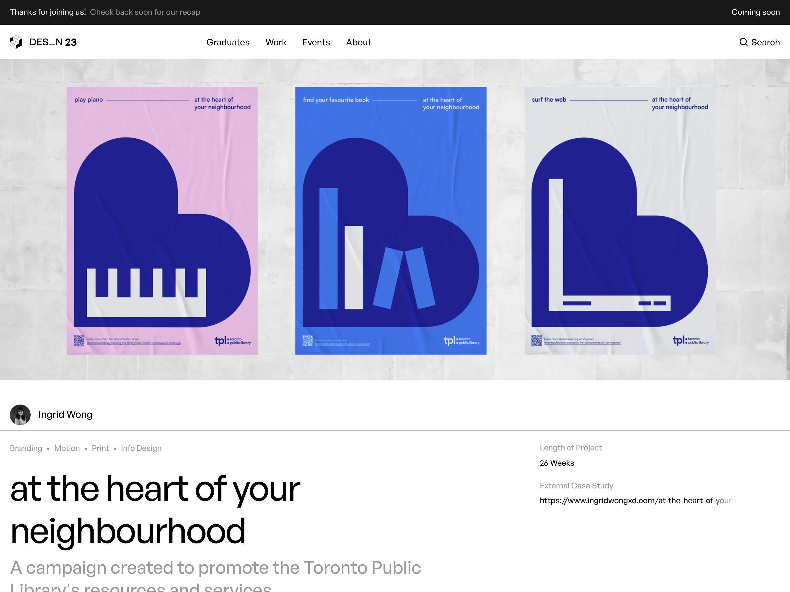
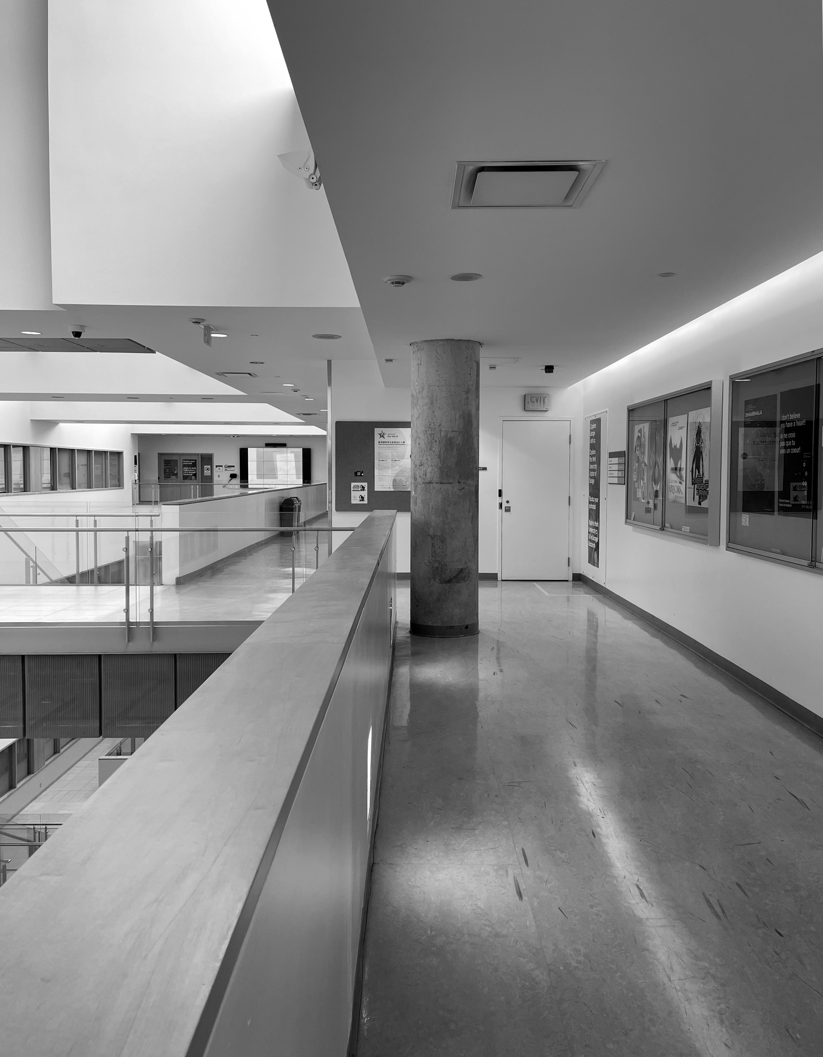
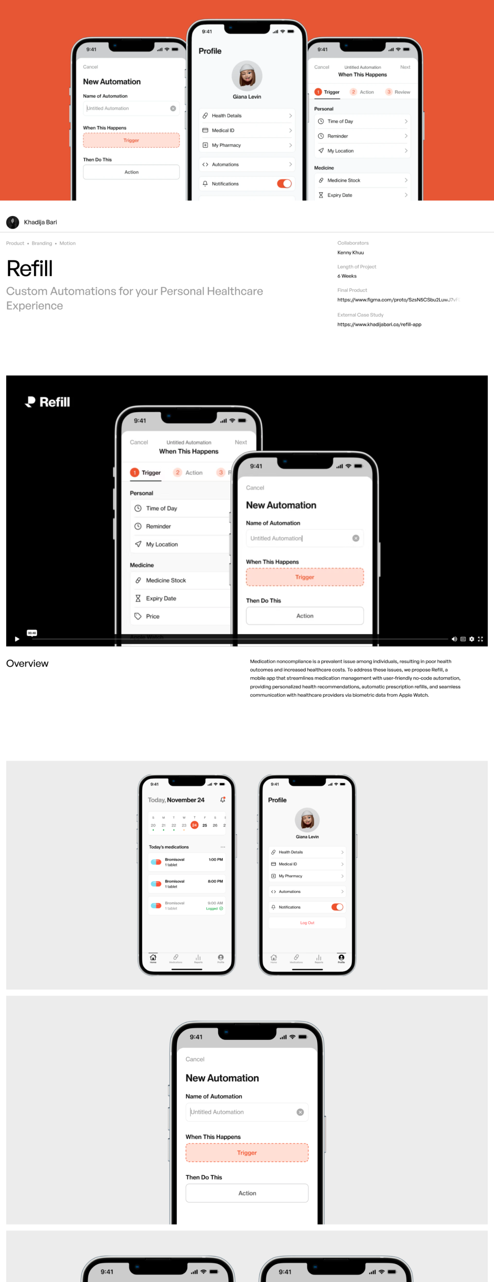
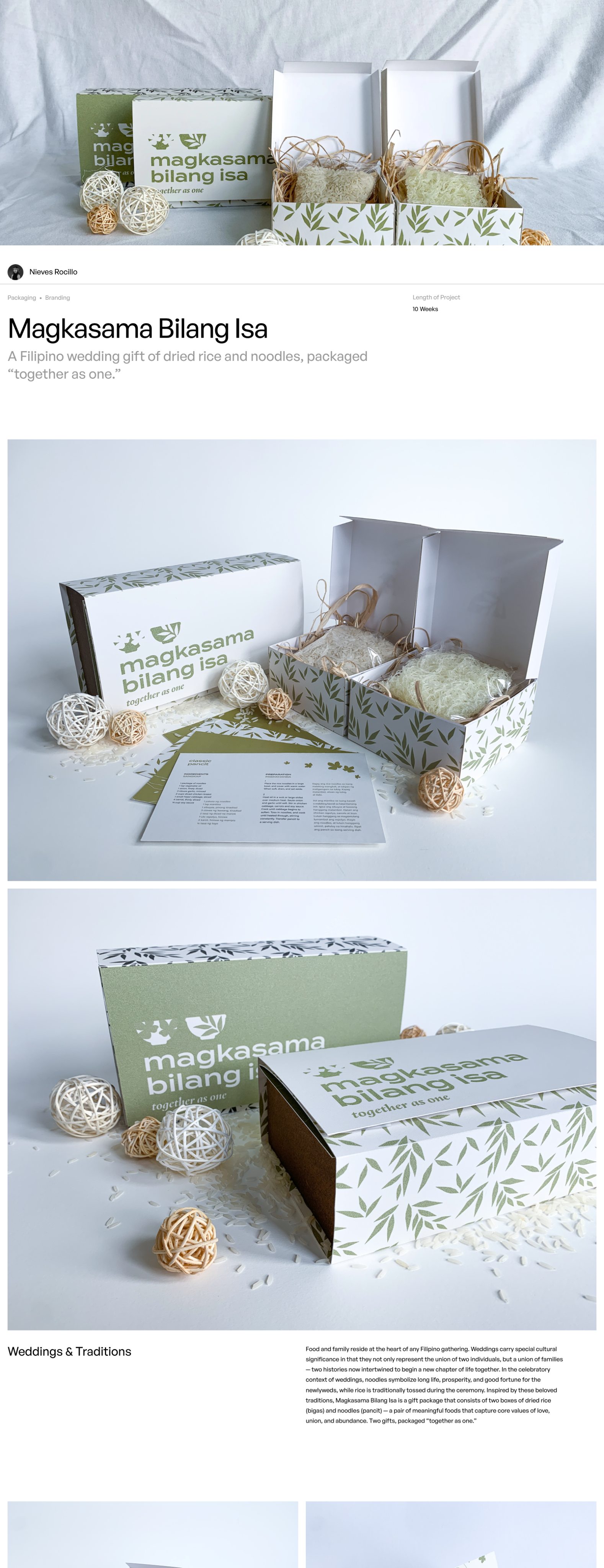
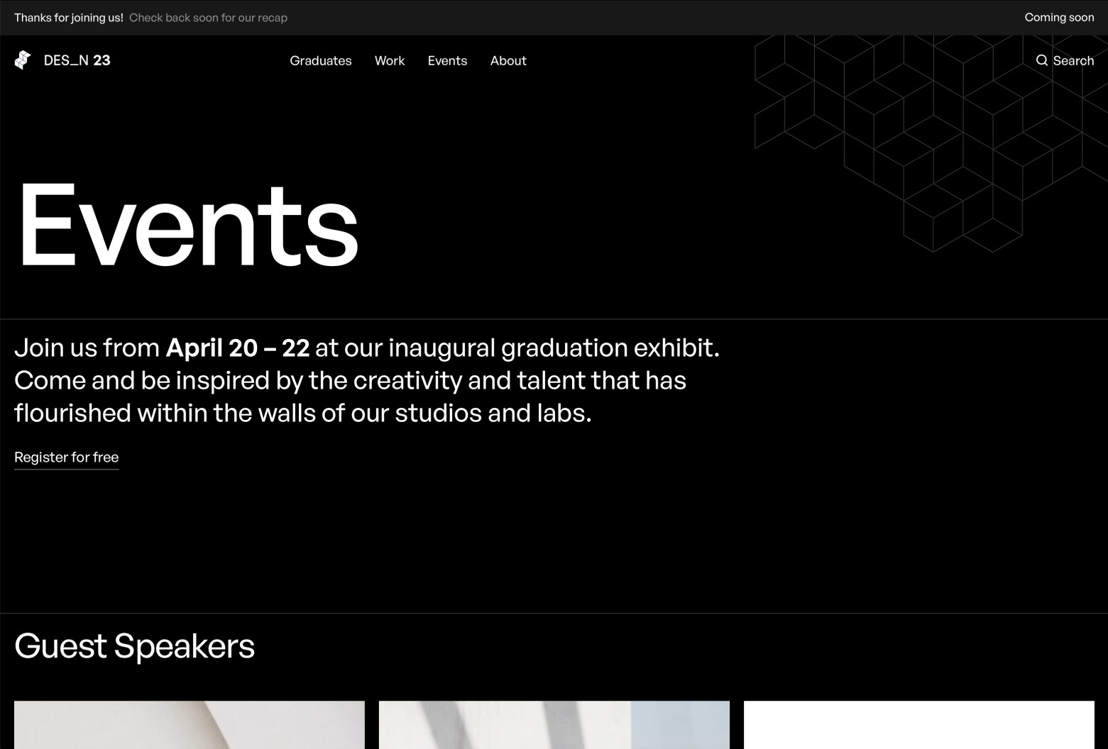
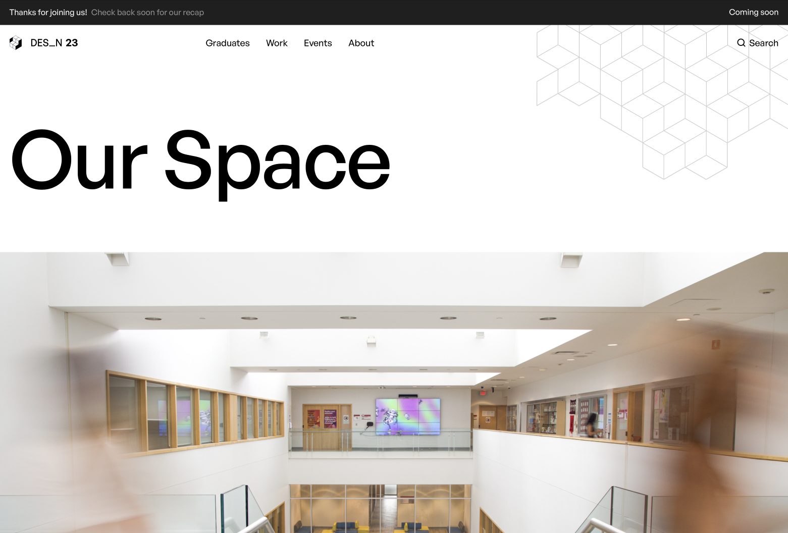
The branding and user interface were designed with the primary goal of surfacing and showcasing design work. To achieve this, the brand utilizes subtle penrose elements on a clean, black-and-white backdrop. Typography is minimal, and white space is generous. In order to give the website a distinct design opinion while remaining true to its objective, tight swiss-style margins, typography, and grids are used to bring an elegant and modern style to each page. Subtle hover interactions over links and seamless page transition fades help polish the user experience.
"A clean type hierarchy, immediate and subtle feedback on interaction
with
UI
elements, and a strong grid makes this website dynamic, modern and effective."
Judges, RGD Student Awards
End of a chapter, start of an era
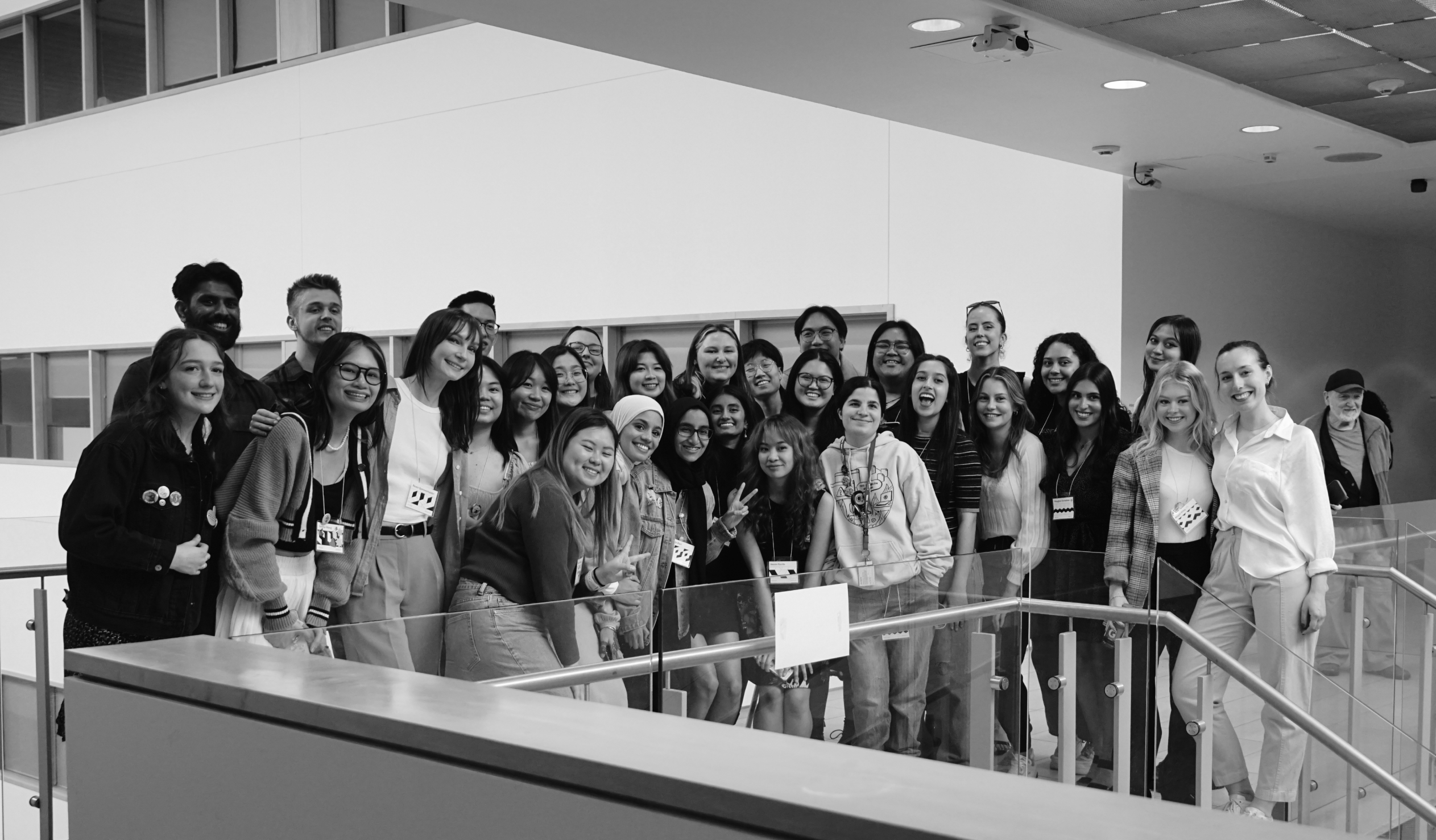
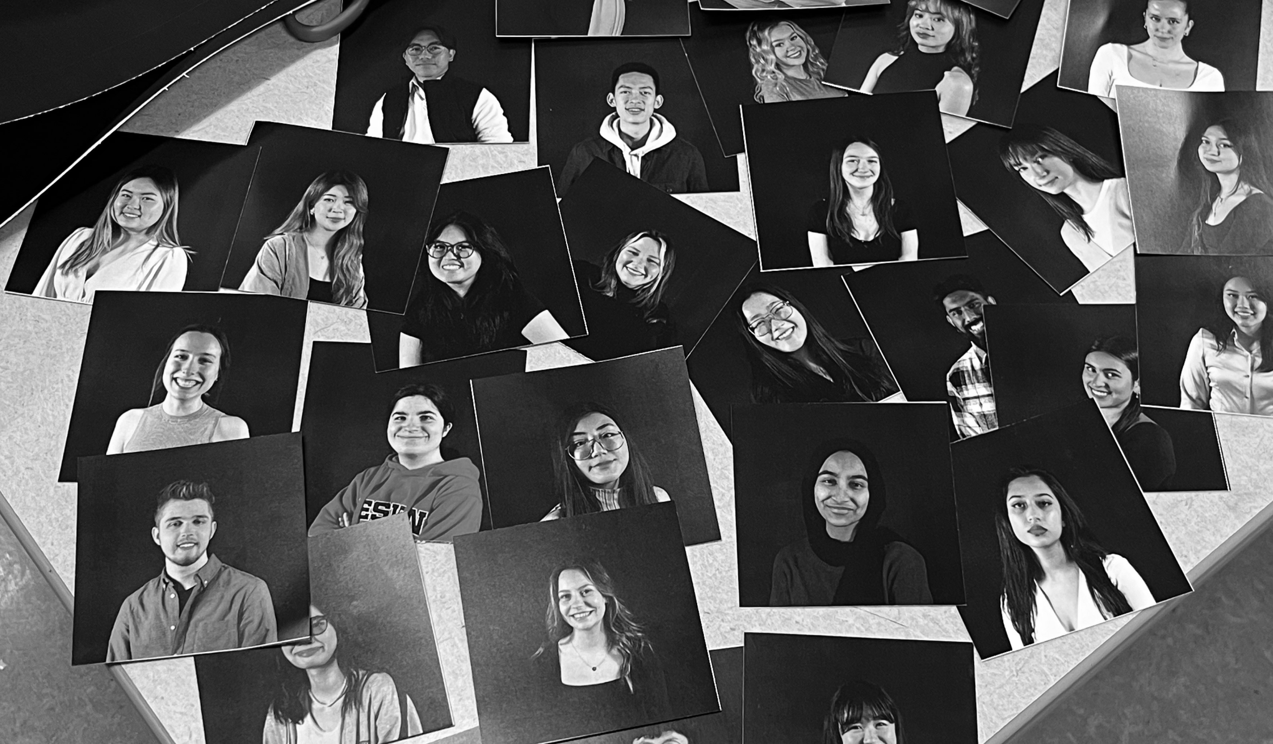
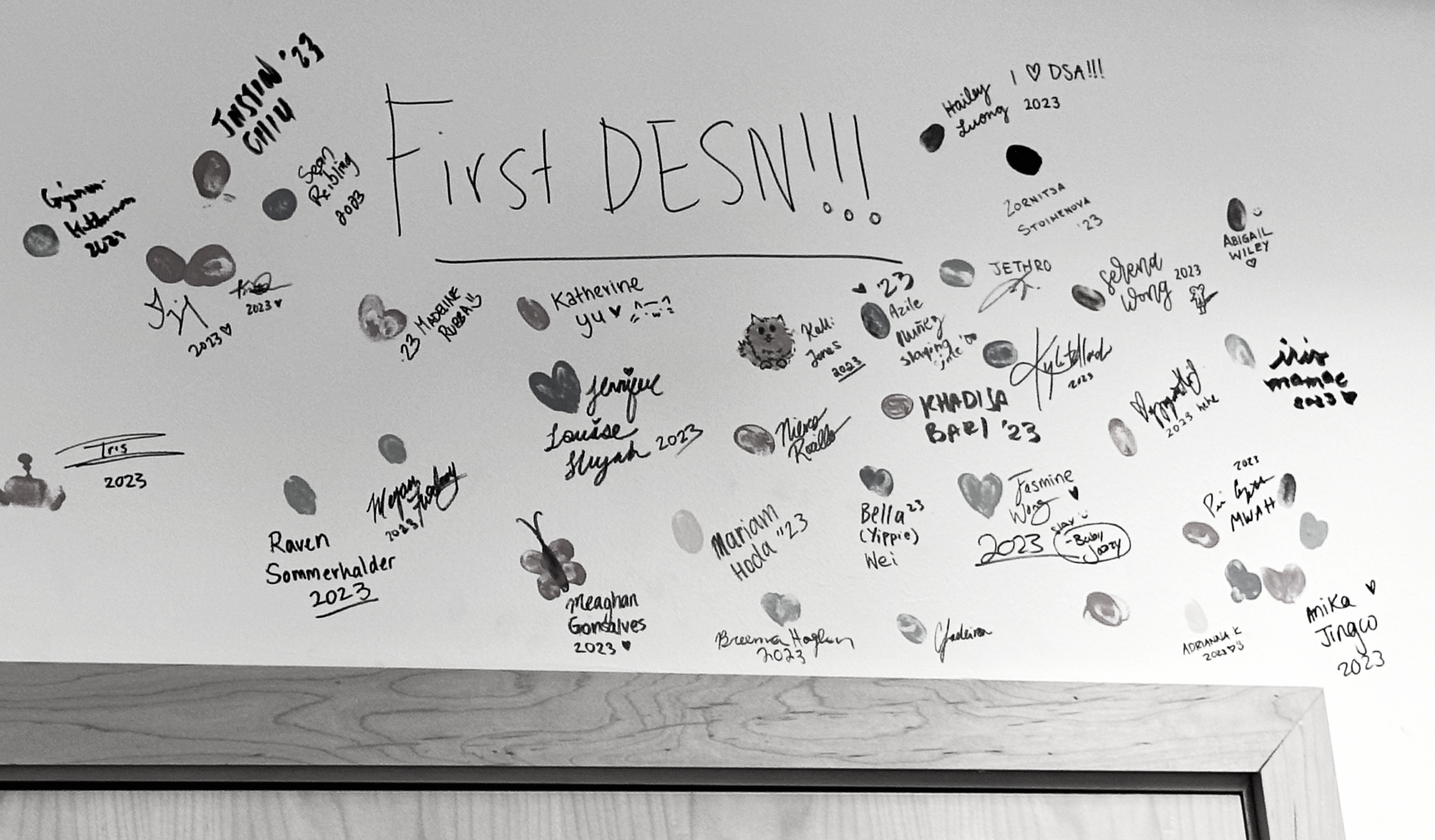
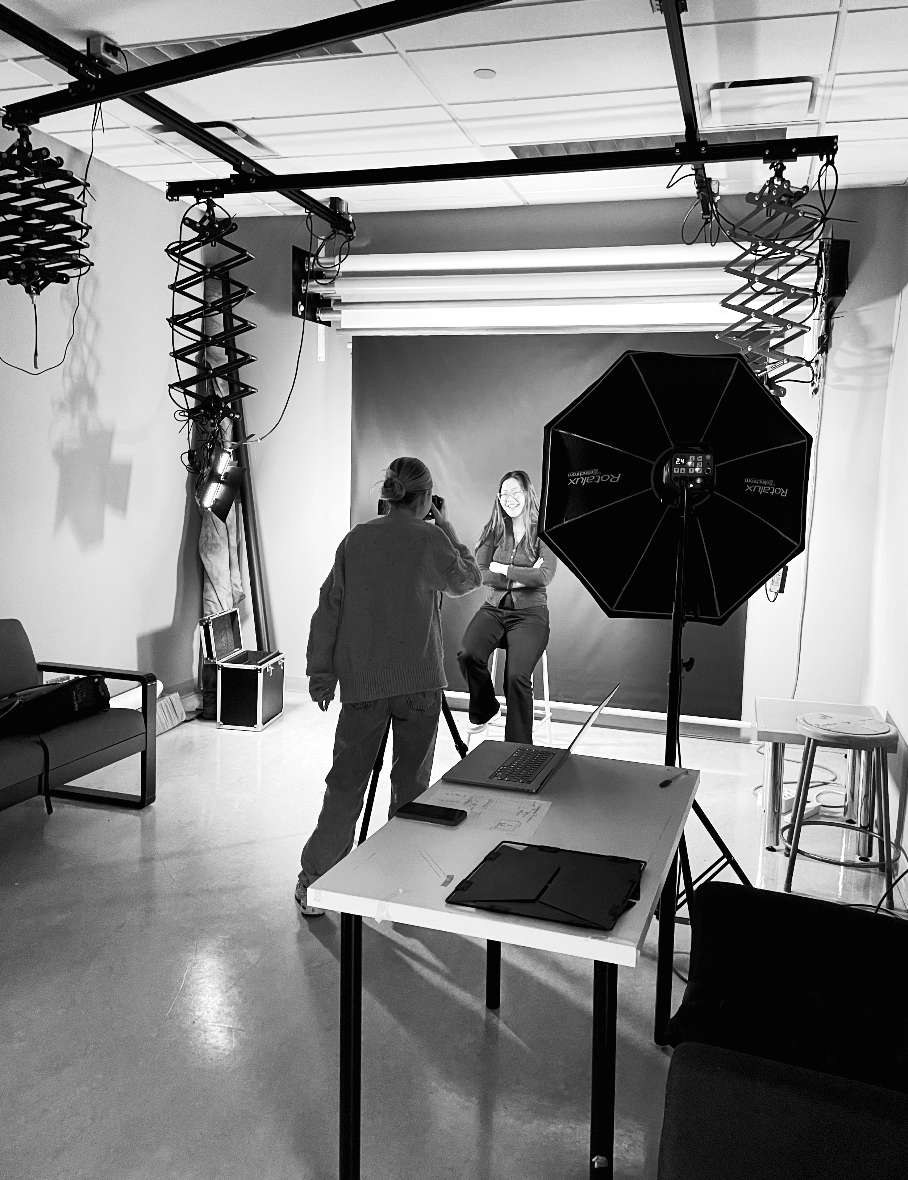
On a personal note, this project is significant because it marks the end of a four-year journey in design education. This program stretched and challenged me as a creative thinker, and introduced me to many incredible people along the way. Working alongside my colleagues and friends to properly showcase our cohort's culminating work was a fulfilling way to close out my time at York University. Conversely, this site also marks the beginning of a new era of designers. As the first cohort of graduates in the York Program in Design, it was a unique opportunity to introduce the wider community to a new program that is sure to produce high quality talent in the years to come.
